This real Power BI project was developed to convert a detailed monthly management information system into a decision-oriented dashboard for finance, commercial and operational users. The report connects top-level performance with the divisions, periods and cost categories that explain the result.
1. The reporting challenge
The underlying MIS contained multiple dimensions: business segment, division, fiscal period, quarter, month, budget version, actual result, prior-year result, operating expense, cost of sales and profitability. A static report could show totals, but it could not quickly answer the management questions behind those totals.
The project therefore focused on five recurring questions:
- How far is actual performance from budget and from the prior year?
- Which division or business segment is creating the variance?
- Is the gap concentrated in a particular month or quarter?
- Are operating expenses supporting performance or eroding profitability?
- How does the current year compare with the longer-term cost and profit trend?
2. Project objective
The objective was not simply to visualize numbers. It was to create a common performance language for finance and non-finance users. Senior management needed an executive summary, while operational managers required enough detail to investigate the drivers and take action.
The design therefore followed a layered approach: an overview for rapid interpretation, divisional and segment pages for accountability, OPEX pages for cost control, and historical pages for trend and margin analysis.
3. Dashboard scope and page structure
Executive MIS overview
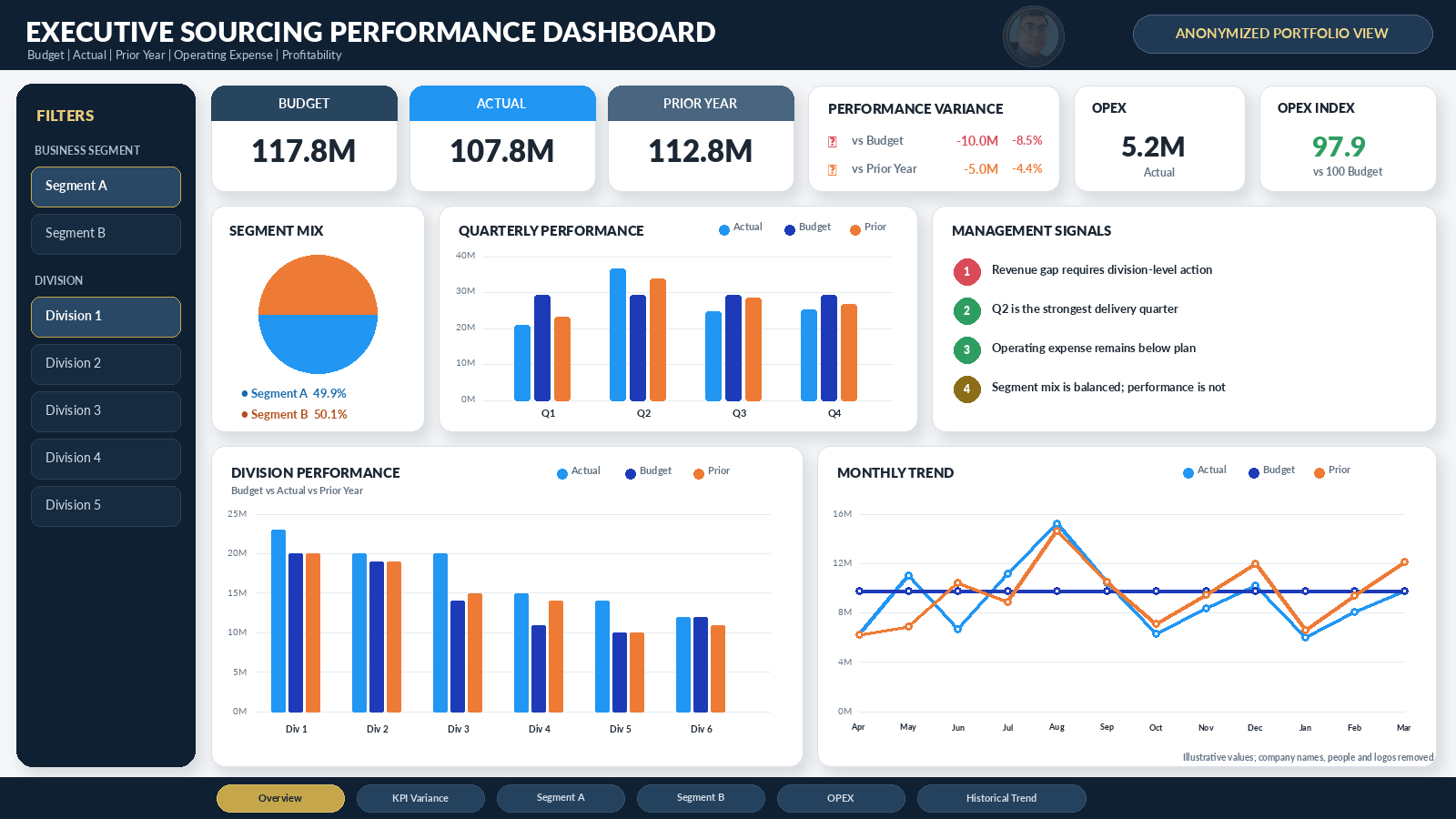
The overview brings together budget, actual and prior-year values, overall variance, business-segment mix, quarterly performance, monthly trends and division-level comparisons. This allows a user to identify the direction of performance before moving into the detail.
Divisional and segment analysis
Separate views compare business units and divisions using the same KPI definitions. Ranking, variance indicators and monthly movement make it easier to distinguish a structural underperformance issue from a short-term timing issue.
Operating-expense analysis
The OPEX pages organize cost categories such as personnel, shared services, infrastructure, travel, external services and other overheads. Actual cost is assessed against budget and prior year, both in total and by division.
Historical performance
Multi-year pages show cost of sales, office OPEX, OPEX percentage, profit before tax and profit margin. These views help management evaluate whether apparent improvement is sustainable or merely caused by changes in scale or timing.
4. KPI framework
5. Main management insights enabled by the dashboard
Variance becomes traceable
A top-level budget gap is immediately decomposed by division, quarter and month. Management can therefore move from “performance is below plan” to “this specific unit and period explains the majority of the gap.”
Cost control is linked to commercial performance
Lower OPEX is not automatically treated as success. The dashboard allows users to assess cost alongside value and profitability, preventing a favorable expense variance from hiding weak business delivery.
Segment mix and concentration become visible
Where two major segments contribute similar overall value, divisional analysis can still reveal very different performance patterns. This supports targeted action rather than applying one response across the whole organization.
Seasonality is separated from structural weakness
Monthly and quarterly trends show whether a variance is caused by normal timing, an isolated event or persistent underperformance. This distinction is important for forecasting and resource allocation.
Historical ratios provide context
Multi-year OPEX and profit percentages help users judge whether the current result is improving in economic terms, not only in absolute currency values.
6. Design and control principles
| Design area | Applied principle | Management benefit |
|---|---|---|
| KPI definitions | Use the same budget, actual, prior-year and profitability logic across every page. | Users do not receive conflicting numbers from different views. |
| Fiscal calendar | Standardize year, quarter and month filters. | Period comparisons remain aligned and repeatable. |
| Navigation | Separate overview, variance, segment, OPEX and historical pages. | Executives can scan quickly while analysts can investigate detail. |
| Exception display | Use direction, amount and percentage variance together. | Users understand both materiality and relative performance. |
| Reconciliation | Tie dashboard totals to the approved management-reporting source before release. | Finance can rely on the report as a controlled analytical layer. |
| Confidentiality | Limit access and anonymize portfolio material. | Sensitive commercial and personal information remains protected. |
7. Value for finance and non-finance users
For finance teams, the dashboard creates a structured route from total performance to budget variance, OPEX composition, profitability ratios and historical trend. It supports management review, forecasting and variance commentary.
For non-finance managers, the visual hierarchy removes unnecessary accounting complexity. They can see which unit, period or cost area requires attention without reading a long spreadsheet or waiting for a separate analysis.
For senior leadership, the project provides one management view that combines commercial delivery and cost discipline. This is essential because business value, operating expense and profit should not be managed in isolation.
8. Implementation approach
- Mapped the management questions and the existing MIS reports.
- Standardized fiscal periods, divisions, segments and KPI definitions.
- Structured measures for budget, actual, prior year, variance, OPEX and profit.
- Built executive and diagnostic pages with common filters and navigation.
- Reconciled totals and reviewed exceptions with report users.
- Prepared an anonymized portfolio reconstruction without confidential identities.
Conclusion
This project demonstrates how Power BI can transform a complex sourcing and finance MIS into an accessible management system. The dashboard integrates budget control, operating performance, cost analysis and profitability in a form that finance and non-finance users can interpret together.
The portfolio screenshot is deliberately anonymized. It demonstrates the analytical architecture and visual logic of the project without exposing the source organization, its people or its branding.
Editorial note: The reconstructed image uses generic labels and illustrative or rounded values. It should not be interpreted as a current public financial statement for any organization.

Written by Liakat Hossain
Finance and accounts professional with experience in FP&A, SAP FICO, Power BI, internal control, reporting, audit, tax, VAT and export-oriented business operations.
This article is original educational content based on professional finance practice. Real-project examples are anonymized, and scenario figures are identified as model outputs rather than guaranteed results.